My Role:
My team and I were essentially the UX, Creative, Development and Production arm for R360 Environmental Solutions and performed as if we were embedded with the company to help them bring their product to reality.
User research, prototyping, UI web app design, Usability testing. These were some of the services they simply didn't have in-house but leaned on us to work on for a period of time as part of their team.
The Challenge
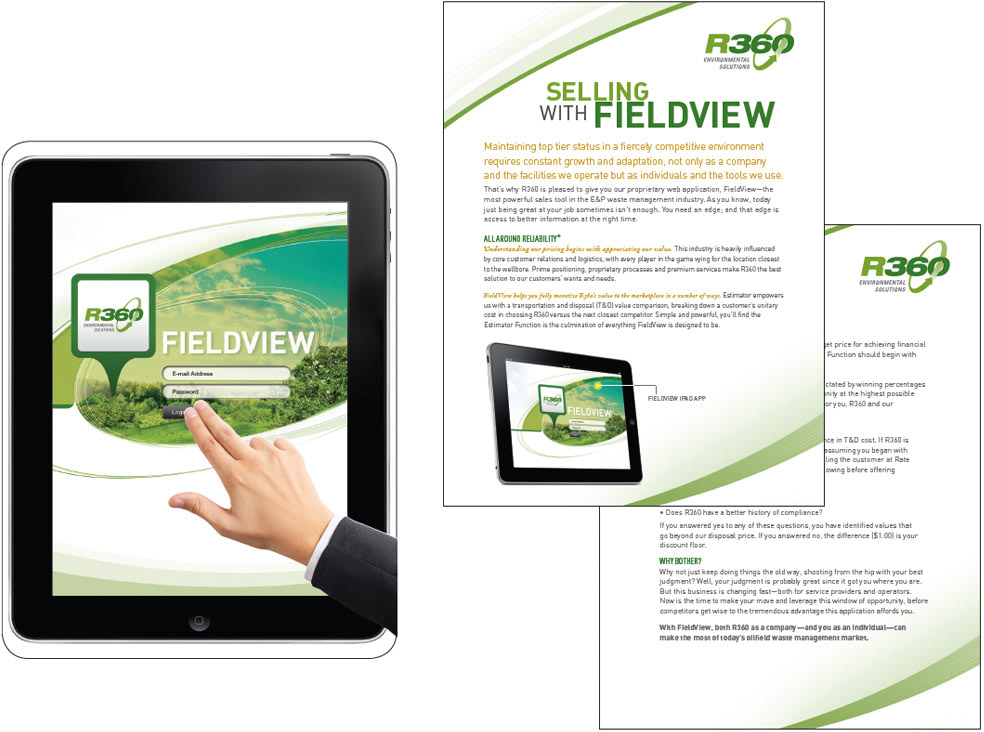
Design and build a game-changer. A sales tool that the client, or its competitors, has never seen before and changes the way business is done. Oh, and you have to do it on an iPad.
Results:
To solve this challenge I started by understanding the current situation, identifying what were the goals of the product? Understanding existent data on who the users were? What problems were they facing while using such an app? What works what doesn't work in the current web app environment? It was important to focus on what actually needs to be changed considering that the client had already provided a majority of the app functions and documentation before hand and as we were building their product. I started with a quick, high-intensity effort that allowed us to define audit the existing provided documentation, define project milestones, understand R360’s long term vision and constraints, and began research into user needs, behaviors, and pain-points.
We didn't have a research team in-house, so the team and I did the research and user interviews with our customers. To really understand our customer's problems, I also put myself in our customer’s shoes. I started to read summaries on how iPad apps were used out in the open field, to better understand what's important for the users and what were the pain-points a person might experience while using the app on the field in such environments.
Some Identified Problems:
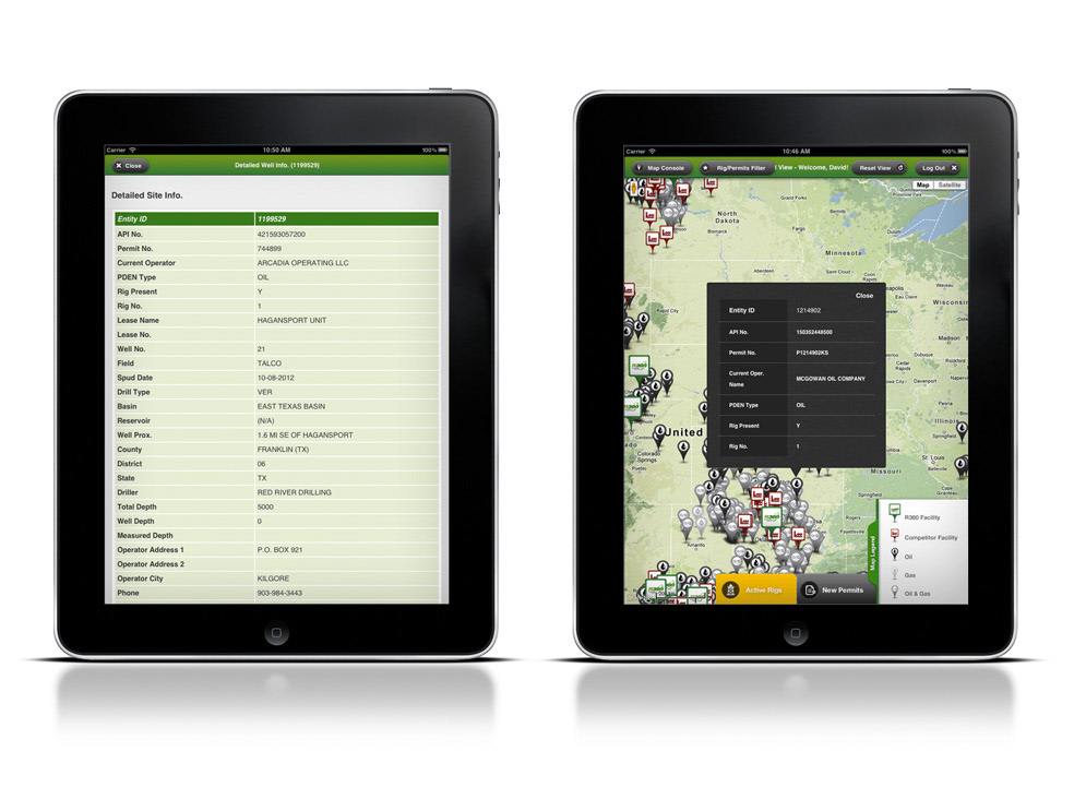
1.) People needed to quickly make decisions if a summary from the app is worth reading? How might we deliver the right content in at the right time so that the sales team and the customers can quickly make decisions without reading further.
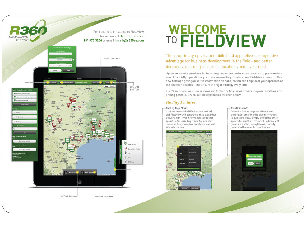
2.) Heavy considerations were taken towards the User Experience touchpoints on what is clickable and how to interact with the map and its legend.
3.) Considerations in click-through actions and hierarchy so the user can take the next and final step towards their ultimate goal.
Adobe Illustrator proved to be the best tool of choice for prototyping at the time. (There are more robust and new tools in 2017 than there were in 2010-11). Because of a very tight timeline, we chose to develop a high-fidelity prototype which had both benefits and drawbacks.
On a positive note, the prototype design and walk through was a powerful method in strengthening our relationship with the client and gaining feedback and approval from both our client and the development team during multiple iterations of the process from start to finish.
Measuring Success:
This web app rolled out in late 2011 and early 2012 and feedback had been extremely positive. These successes lead to the acquisition of R360 Environmental Solutions by Waste Connections Inc. and multiple BMA / AMA Awards
Reflections of what I've Learned:
• User research and iterative testing are key
• Put yourself in your customer's shoes
• Design Principles and Thinking/Doing will forever matter